Main content
This is the main content. This is the main content. This is the main contnet.
Style attribute allows configuring look and feel right on the element. Although it is very convenient it is considered bad practice and you should avoid using the style attribute
Instead of changing the look and feel of alll the elements of the same name, e.g., P, we can refer to a specific element by its ID
Here is an other paragraph using a different and a different look and feel
Instead of using IDs to refer to elements, you can use an elements CLASS attribute
This paragraph red background is referenced as
.selector-2 .selector-3
meaning the descendant of some ancestor.
Whereas this span is a direct child of its parent
You can combine these relationships to create specfic styles depending on the document structure
The text in this paragraph is red but this text is green
The background of this paragraph is red but the background of this text is green and the foreground white
Solid fat red border
Dashed thin blue border
Rounded corners on top
Rounded corners at the bottom
Rounded corners all around
Different rounded corners
 Lorem ipsum dolor sit amet, consectetur adipiscing elit, sed do eiusmod tempor incididunt ut labore et dolore magna aliqua. Ut enim ad minim veniam, quis nostrud exercitation ullamco laboris nisi ut aliquip ex ea commodo consequat. Duis aute irure dolor in reprehenderit in voluptate velit esse cillum dolore eu fugiat nulla pariatur. Excepteur sint occaecat cupidatat non proident, sunt in culpa qui officia deserunt mollit anim id est laborum.Lorem ipsum dolor sit amet, consectetur adipiscing elit, sed do eiusmod tempor incididunt ut labore et dolore magna aliqua. Ut enim ad minim veniam, quis nostrud exercitation ullamco laboris nisi ut aliquip ex ea commodo consequat. Duis aute irure dolor in reprehenderit in voluptate velit esse cillum dolore eu fugiat nulla pariatur. Excepteur sint occaecat cupidatat non proident, sunt in culpa qui officia deserunt mollit anim id est laborum.Lorem ipsum dolor sit amet, consectetur adipiscing elit, sed do eiusmod tempor incididunt ut labore et dolore magna aliqua. Ut enim ad minim veniam, quis nostrud exercitation ullamco laboris nisi ut aliquip ex ea commodo consequat. Duis aute irure dolor in reprehenderit in voluptate velit esse cillum dolore eu fugiat nulla pariatur. Excepteur sint occaecat cupidatat non proident, sunt in culpa qui officia deserunt mollit anim id est laborum.Lorem ipsum dolor sit amet, consectetur adipiscing elit, sed do eiusmod tempor incididunt ut labore et dolore magna aliqua. Ut enim ad minim veniam, quis nostrud exercitation ullamco laboris nisi ut aliquip ex ea commodo consequat. Duis aute irure dolor in reprehenderit in voluptate velit esse cillum dolore eu fugiat nulla pariatur. Excepteur sint occaecat cupidatat non proident, sunt in culpa qui officia deserunt mollit anim id est laborum.
This is the main content. This is the main content. This is the main contnet.
| Quiz | Topic | Date | Grade |
|---|---|---|---|
| Q1 | HTML | 2/3/21 | 85 |
| Q2 | CSS | 2/10/21 | 90 |
| Q3 | JavaScript | 2/17/21 | 90 |
| Average | 90 | ||
| Very | long | set | of | columns | Very | long | set | of | columns | Very | long | set | of | columns |
|---|---|---|---|---|---|---|---|---|---|---|---|---|---|---|
| Very | long | set | of | columns | Very | long | set | of | columns | Very | long | set | of | columns |

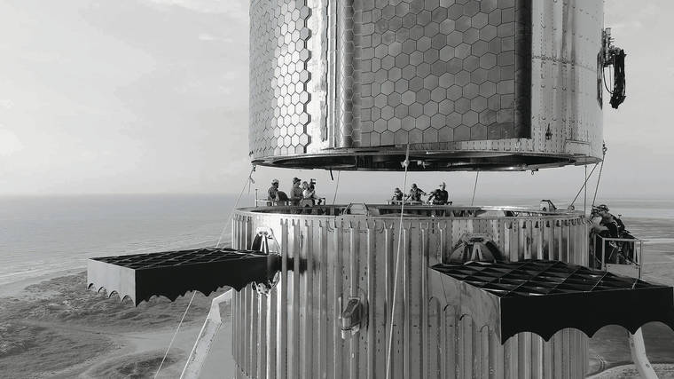
Stacking the most powerful rocket in history. Mars or bust!